By popular demand, here’s a quick showcase and tutorial for my recent “Cartel Bruiser” character/objective figure. I don’t have a name for him just yet. Does he need one? Anyway, I’ll focus on the tattoo work, with some notes on the rest of the process.
As several have asked, this mini is a modified HeroClix Drax, which works fairly well with “heroic” 28mm or 32mm depending on your parlance. (Look through your local shop’s unboxed Clix minis… there are a few gems in there like this one.) The fig’s foot-pins were easy to pop and shave, and the space pistol was likewise easy to replace with a crudely-sculpted Desert Eagle upper.
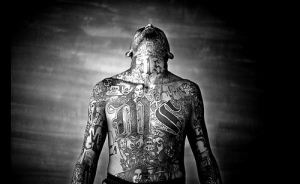
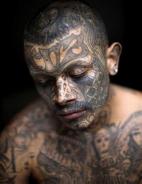
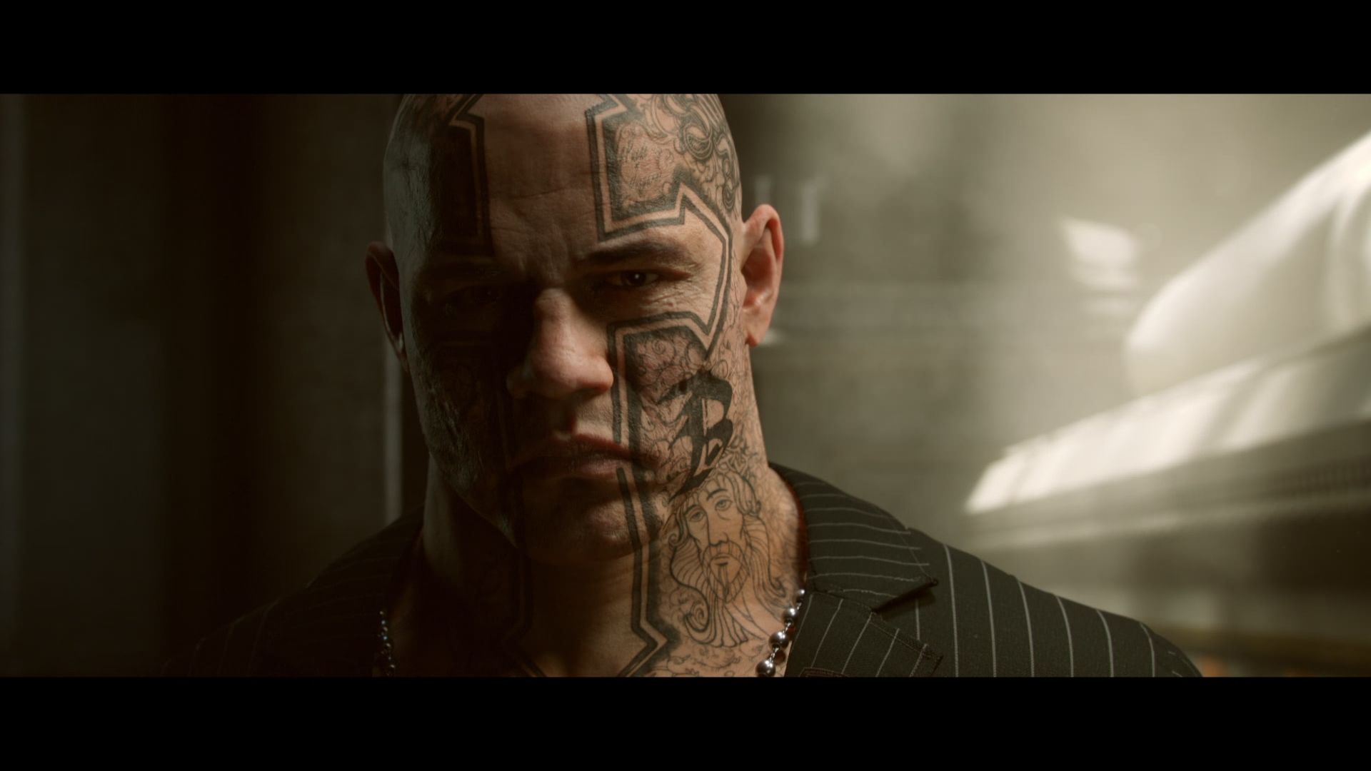
For this project I started with a lot of inspiration research for the tattoos. I knew I was going for that super-dense veteran cartel look, mixed with a little nightmare fuel, not unlike “el Sueño” from Tom Clancy’s Ghost Recon: Wildlands. Most of that character (see header) is covered up, but there were plenty of other sources to pull from. The whole ensemble should add up to the kind of dude you don’t want to meet… ever.

So to begin your own rendition:
1) Establish the look you’re going for by way of reference photos. South and Central American gangster tattoos look different than those of the Brotherhood or Hells Angels, in terms of text fonts, cultural iconographies, artistic styles, etc.
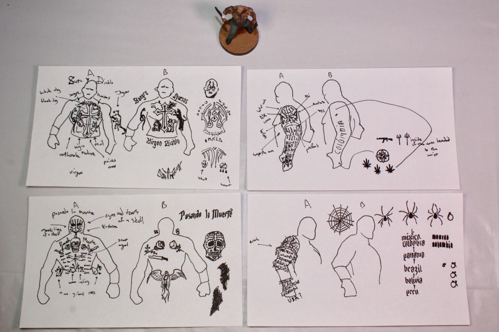
2) Plan your mini’s tattoos on paper. I used a pen and index card with the mini’s silhouettes to get the full surface area plotted. They don’t need to be perfect, but penning them out helps you understand how much you can expect to fit on your mini, and what text and icons are most important. (Pro tip: hold out your plan at arms length, and “scale” the mini next to it in your vision to get a preview of the look.)
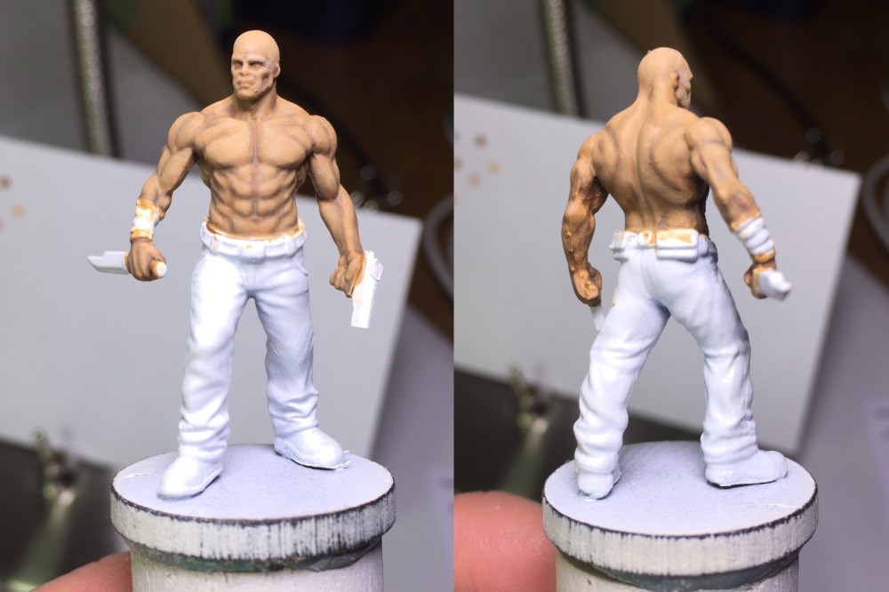
3) After priming, paint and shade/highlight the skin of your mini. I may do a skin tutorial sometime, but the idea is to give a visible “terrain” if you will, over which the tattoos will lay (rather than simply a flat skin surface). I used a base tone, a shadow, and two highlights, glazed and blended. Army Painter washing may work, but I think it tends to look dirty and you won’t want anything to distract from the designs. Whatever your preference for shading, keep the paints and mixes you used in mind (and on hand) for later. Also, take a picture of the mini at this stage for future reference, front and back.
4) Decide on a tattoo color.* Bear in mind that real tattoos are never the shade of the raw die, but said color mixed with the skin tone of the person. Further, a black tattoo, because of the dye properties, will either appear slightly greenish or purplish as it fades. What you see in my final is a combination of those two factors for color: A dark green, mixed with grey (less to darken, more to dull it down), and some of the base skin to integrate naturally with the un-inked skin. Mix this “default” tattoo color, and a second “ghosting” color (more skin base added, making it about halfway between raw skin and full ink).** Unfortunately I don’t have specific ratios for this, but it will likely depend on your paints and preferences anyway.
5) Thin down some “ghosting” color to a glaze, and outline your major icons and text. Reference your plans and start from the center of each region (front, back, arms, face/head) and work out, filling to the fringes with extra icons if necessary. Feel free to silhouette the larger icons and “carve out” later with some thinned skin base. If some text is too small to paint, give the impression by appropriate block shapes ( tall and thin for “l”, fat and below the line for “g”) The ultimate aim is density, but you should be able to tell the designs apart.***
6) With all the outlines in place, return with your default tattoo color (again thinned to a glaze) and solidify borders and major shapes by layering. As you need, go back and “carve,” trim, or shape your icons with the skin base tone. For all but the boldest icons, fill in solid shapes with the “ghosting” color (as in the black dog, or the angel’s cloak). Let all of this dry, as you’d hate to smear your beautiful new ink-job. Should look something like this.****
7) Most important, and most overlooked: Return with your skin shadow and highlight tones, and thinly re-shade/highlight the mini over the tattoos. This simple addition at once varies the tone of the tattoos and marries them to the contours of the skin, reinforcing the shape of musculature beneath. Not so thick as to break up the design, but enough to notice… and if you feel like you don’t notice anything immediately, play with it until you will. You definitely will.
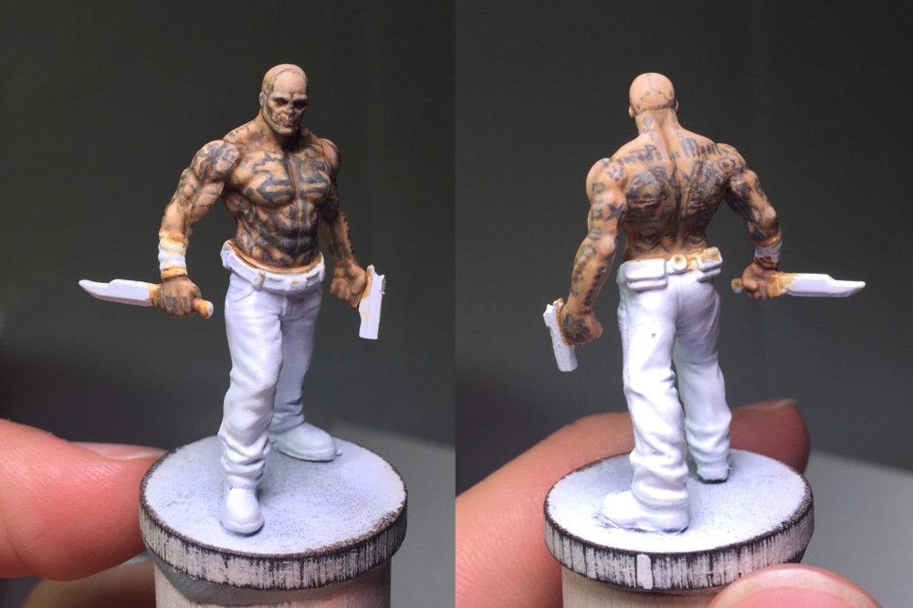
8) Lastly, finish the mini. Choose clothing colors that complement the tattoo’d skin. Odds are your figure will look darker now with the ink, so maybe pick something darker for contrast… or lighter to brighten the whole look. I went with the latter, and avoided pure blacks, as this makes it more obvious to the eye that the tattoos actually aren’t black. (Pro tip: If this is a gaming mini, as mine is, take it to other and worse lighting than your workspace, and look it over before you call it done. You’ll want to be comfortable with how it looks in most places, not just under your close fluorescents.) Finished:
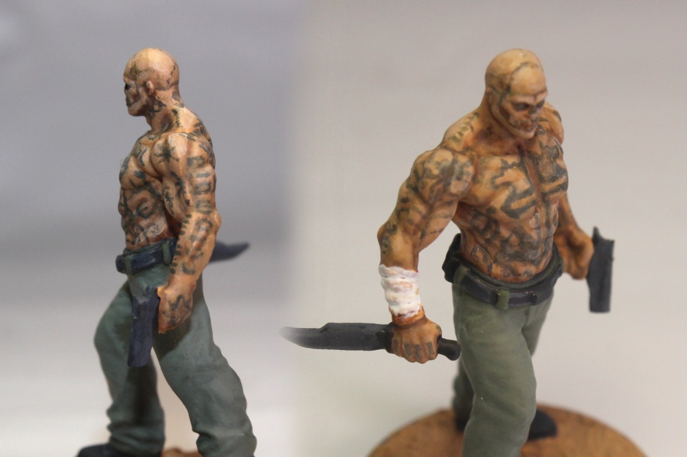
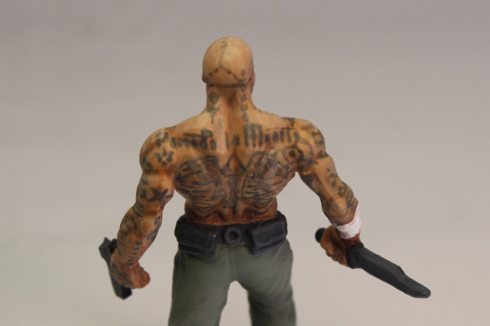
Some detail shots for you, illustrating various points above.
A few closeups of details illustrating various points above.
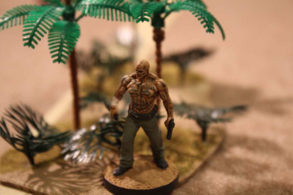
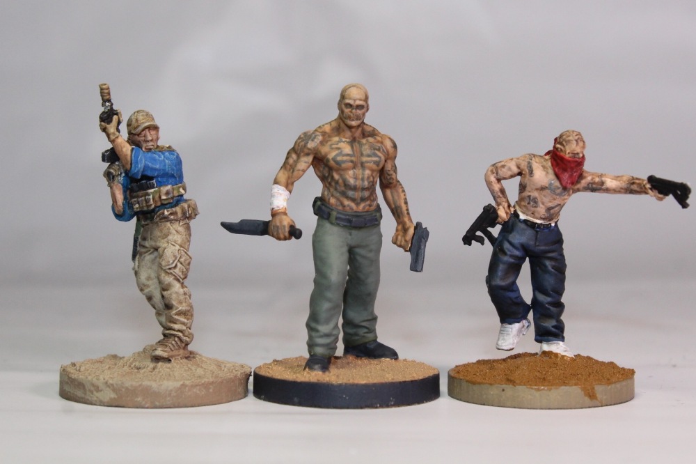
Next to a few minis from the Spectre Miniatures range (painted by my brother), with which this fig will be used in games of The Battlefield: Miniature Modern Warfare:
And a cautionary tale about acryl coating. I use it to protect from dents, but do be aware that acryl, regardless of the advertised finish, may have a tendency to dull all colors, reduce the contrast between your brightest and darkest tones, and leave a bit of a sheen anyway. Work with it on other minis first before slathering it all over your nice new tattoos, and do go gentle. You can see below what happened when I didn’t (easily fixable, but fairly frightening “rub” spots on the pants and belt):
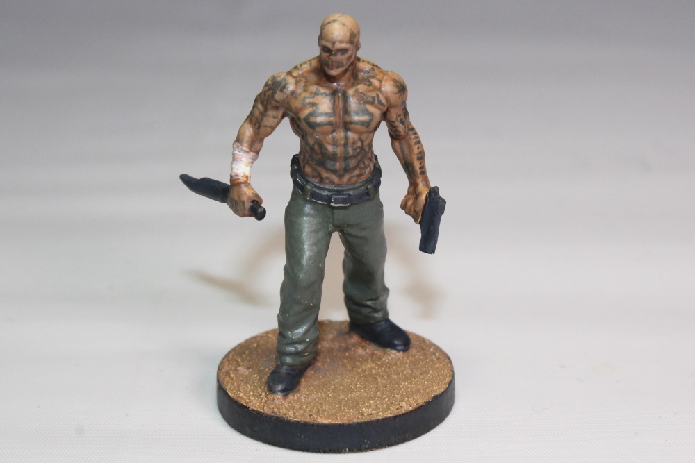
Finished, my “Cartel Bruiser” should appear in a Shoot report soon, once my brother finishes the terrain.
If any points in this tutorial need clarifications, or if you’d like more specific details on certain parts of the process, please leave a comment below or (for those of you coming from Facebook) message me and I’ll be happy to answer as I can.
Notes:
* I owe a great deal to GCTStudio’s tutorial on Alberto Gil’s Bushido tattoo work; most of what I say here and below is summary of his very helpful step-by-step, with some things I learned along the way. Please go visit this tutorial and his site for far more help and skill on stuff like this.
** With the outline and the tattoo tones, thinning them to a glaze allows mistakes to be made without devastating the design. A tiny brush (I used a 10/0) will do a fair job of keeping the thinned paint in tight lines, provided you mediate the amount and flow of liquid in the bristles. (By this I mean that if it runs too much, soak a tiny bit off with a napkin, and if you paint like I do, check that gravity is pulling the liquid toward your mini rather than away.) The drawback is that layering is almost always necessary until you get the flow down. But as subtlety is the game here, layering is much better than overdoing it with a heavy line. As usual with this hobby, more time = better results.
*** At this point, please take a break. This is a time-consuming process, I know… it’s worth it, trust me. Step away from the miniature for at least an hour and put your mind to something else, then come back. I’ve found time and time again that working like an obsessive madman on a project, starting and finishing in the same sitting, produces something I won’t be able to come back to and like what I see. You’ll want something that no matter how many times you look at it, you still like what you see. Take a break now, and at the end of the next step.
**** Obsessive asterisking much, I know. To be honest this photo actually includes the next step, but it illustrates basically what you’ll see before you finish everything else.
Image Source: El Sueño; Cartel Tattoo One; Cartel Tattoo Two; Cartel Tattoo Three
All other photos by Joseph Klingman

Awesome. I like the little details. Thanks for sharing!
LikeLiked by 1 person